Accessible routine-support buying guide
Best Digital Kitchen Timers With Large, Readable Displays
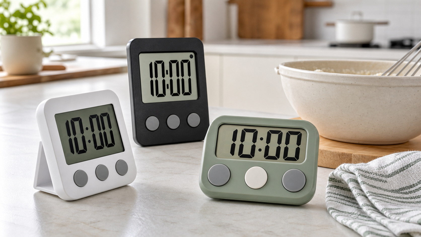
A timer is only useful when you can read it from the place where you cook and operate it without guessing. For a reader with low vision—or anyone tired of tiny gray digits—the best fit is determined by measured display details, contrast, viewing angle, controls, and alert options, not a vague “large display” label.
As an Amazon Associate, GoodWeighFinds earns from qualifying purchases.
Who this guide is for
This guide is for adults who want a dedicated cooking timer with a display and controls that are easier to see than a typical small appliance screen. It also suits readers who prefer a timer over a phone or voice assistant. A kitchen timer can reduce routine friction; it does not change food, health, or weight outcomes.
This is a focused companion to our broader kitchen timer guide. For other practical tools that support planning and cooking without body-result promises, use the routine-support tools pillar.
Best-fit formats, not unsupported rankings
- Best fit for across-counter viewing: A freestanding timer with published digit dimensions, strong contrast, and a stand that holds a useful angle.
- Best fit for close-up operation: A simple model with large, separated buttons and a predictable setting sequence.
- Best fit for changing light: A display with a user-controlled backlight that stays on long enough to read without hiding the digits in glare.
- Best fit when sound alone is unreliable: A model with a visible flashing cue or vibration mode, confirmed in the manual for the exact model.
- Best fit for a fixed work zone: A securely mounted magnetic or wall-hung model positioned away from heat, steam, and splashes.
Selection criteria that matter
- Digit size: Look for the height of the numerals, not just the overall screen or product dimensions. If no measurement is published, ask the seller or use a returnable purchase to check it at home.
- Contrast: Dark digits on a pale background often provide useful contrast, but reflections and low-contrast secondary labels can still make a display difficult to read.
- Viewing angle: LCD digits may fade when viewed from above, below, or the side. Check whether listing photos or the manual show the display from the angle you will use.
- Backlight: Verify how the light turns on, how long it remains on, and whether pressing it changes or stops the countdown.
- Control separation: Prefer distinct button shapes, spacing, raised edges, or tactile markers that make start, stop, reset, minutes, and seconds easier to distinguish.
- Setting sequence: Check whether a mistaken entry can be corrected without clearing everything and whether holding a button changes numbers at a manageable speed.
- Alert options: Confirm adjustable volume, flashing, or vibration from the exact instructions. “Loud” is subjective, and a fixed loud alarm can be a poor fit in a shared home.
- Placement: Compare stand stability, magnet coverage, hanging points, and the normal reading distance. A large display at a bad angle may be less readable than a smaller screen nearby.
- Battery access: Check battery type, cover design, polarity markings, low-battery behavior, and whether settings survive replacement.
- Return terms: Real-room lighting and individual vision needs vary. A practical return window matters when readability cannot be established from specifications.
A comparison framework you can use
Measure the normal distance from your prep position to the timer, then record the same details for every candidate:
- Published numeral height and display dimensions
- Digit/background colors and reflections under kitchen lighting
- Readability from the intended height and side angle
- Backlight control and timeout behavior
- Button size, spacing, shape, labels, and tactile differences
- Steps required to set, pause, correct, silence, and reset
- Audible, visible, and vibration alert modes
- Stand, magnet, hook, or wall placement options
- Battery type, replacement access, instructions, and return window
Do not treat listing photos as measurements: screens and digits are often enlarged in product images. Compare manuals, dimension diagrams, and seller answers, and save a screenshot of any feature central to your decision.
Accessibility limits to keep in mind
No single timer is “best for low vision” for everyone. Readability depends on acuity, contrast sensitivity, glare, distance, lighting, and the display technology. Tactile controls may matter more than digit size for one person, while a spoken timer or voice assistant may fit another person better. Product pages rarely establish accessibility through independent testing, so this guide ranks criteria and use cases rather than unverified models.
If a timer will be used by several people, check whether volume, light, and vibration can be changed without navigating a hard-to-read menu. A simple physical control is often easier to share than a long-press shortcut.
Who should skip this purchase
Skip a separate timer if a voice assistant, phone accessibility setting, talking timer, oven control, or watch already gives you a clearer prompt. Skip an LCD model when its viewing angle or glare cannot be checked and returns are restrictive. Skip a feature-heavy multi-channel timer if extra modes make the controls harder to identify.
A timer is a reminder, not a food thermometer or proof of safe storage. Follow the instructions appropriate to the food and cooking method and use the right measuring tool when temperature matters.
Bottom line
Start with numeral height, contrast, real viewing angle, and control separation. Then compare alert modes, placement, battery access, and return terms. The strongest choice is the simplest timer you can reliably read, set, correct, and silence in your actual kitchen.